

Doo Doo Dodo

I introduced the Dodo Portfolio exercise concept in January and provided an update in April. The idea was to use Chris Cole’s (explained in the January post) Dragon Portfolio framework and add a Kayfabe Capital analytical spin to birth the Dodo. As stated in each post, this is and has been intended, as an exercise to catalyze critical thinking and discussion about traditional strategic asset allocation methodologies. From the January post:
The Dodo Bird model portfolio is intended to be conceptual and not financial advice for any individual. I am sharing this for educational purposes and to try and introduce some of these concepts. It does not take important factors such as taxes, etc. into account. Please seek out a non-fake professional if you require assistance. In a real portfolio, I would not ‘snap’ the exposure as this one will be.
Additional context from the April update:
The goal of the model is to generate 3-5%+ average annual “real” returns over full market cycles, with drawdowns and volatility profiles generally below those of traditional strategic asset allocation strategies.
The Kayfabe Capital cycle timeframe base case remains that a severe global recession will unfold, with financial markets (excluding interest rates) not yet discounting this scenario.
While drawdowns are never enjoyable, this one has been of the “bring it on” variety, which is to say that it has transpired in a way that presents opportunity from a cycle timeframe, in my view.
The “bring it on” drawdown continues, with this snapshot of the portfolio as of the US close on July 20th:
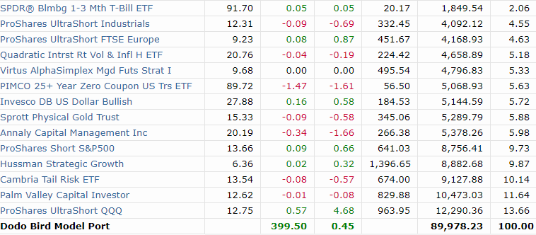
Relative to the goals laid out, this is a significant, if normal, drawdown within the context of having no intended correlation with broader financial markets. For a strategic asset allocation model, a 10% drawdown is run-of-the-mill during mid-cycle corrections, and I would argue that market movements this year have not been of the run-of-the-mill variety.
Activity in the portfolio has been muted since the ‘launch phase’ move in equity markets commenced at the end of May and into June. Positions allocated to short exposure and equity volatility have obviously fallen significantly, while fixed income and foreign exchange-related exposure have netted out to be a modest positive.
The incremental approach to scaling into equity short and volatility exposure, which comprises about 75% on a beta-adjusted basis, has kept the overall drawdown to a reasonable level. In contrast, the selection of the Nasdaq 100 index as core short exposure, and via a twice-leveraged ETF, has been a material negative.
One of the aspects of investing that remains a daily grind is achieving awareness and then acting to implement decisions from lessons that should have been learned from the past. However, this is an example of a failure in this regard, as I went through a similar episode during the 2007-2009 cycle.
Having successfully identified US financials and REIT’s as leading industries to the downside in that cycle, I had started to deploy them as shorts/hedging positions in May 2007. By the lows reached the Tuesday following the Martin Luther King holiday in January 2008, I made the decision to take the considerable gains in those positions, with the expectation of ‘reloading’ into rallies.
A rally proceeded into February when I made the stupid mistake of pivoting to pick fights with lagging market segments - emerging market equities and US small caps. What followed was six months of unnecessary anxiety and performance drag, as those areas remained resilient until the ‘oh sh*t’ point of the cycle began to unfold in September 2008. While the positions ended up being very positive performers, the pathway and decision-making were poor.
Fast forward to 2023 and the Dodo exercise, and this dummy made the exact same mistake once again!

The confluence of the AI-inspired speculative fervor and the nexus of passive flows and the zero days to expiry (0DTE) equity options mania made the decision to target a laggard REALLY DUMB and costly. To put this into some context, comparable exposure in US small caps (oh the IRONY!) over the same period would have resulted in several percent in improved overall model performance.
Another poor decision was to exit the yen-hedged Japanese equity ETF in February and then not reload when the expected short-term correction emerged, which was ‘worth’ about another 100 bps in performance that could have resulted from better decision-making using my own process.
Despite the widespread capitulation unfolding across Wall Street relative to what is unfolding in the business cycle, events have largely continued to unfold along the lines of a severe global recession beginning to unfold as Q2 transitioned into Q3. The much-hyped reopening in China has been a dud, and a significant amount of economic data coming out of Europe has been extremely weak.
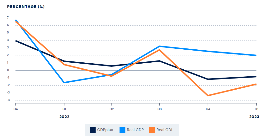
Even in the US, with the very important exception of employment data, recessionary inflection points were reached on a rolling basis starting last autumn. A simple consolidated way (if flawed) is the Philadelphia Federal Reserve’s GDPplus model, which attempts to blend GDP and GDI data. Here are the recent disparities between the three:
On vital aspect to remember with these reports is that the GDP data is not uniform - i.e. this period includes GDP data that is subject to potential future revisions. For example, here is what ‘history’ reports on the 2008 cycle:
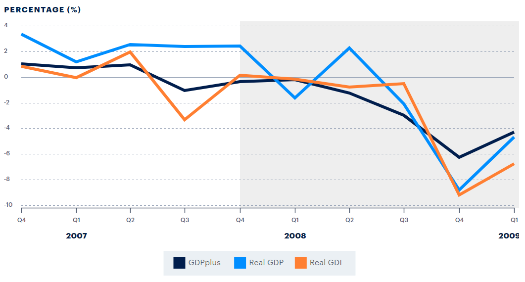
The challenge? The blue line for Real GDP shows +2.4% for Q4 2007, with NBER subsequently dating the beginning of the GFC recession as December 2007. GDP is released with 3 advanced estimates, and then subsequently revised as more hard data is obtained. In each of the first 3 advanced estimates for Q4 2007, growth was estimated to have been +0.6%, but was then revised down to -0.2% in July 2008. That was quite a difference compared to the ultimate revision to +2.4%
As we can see from the GDPplus report, the model smoothed out some of this ‘noise’ via data quality and revisions. Here was the 2001 recessionary period:
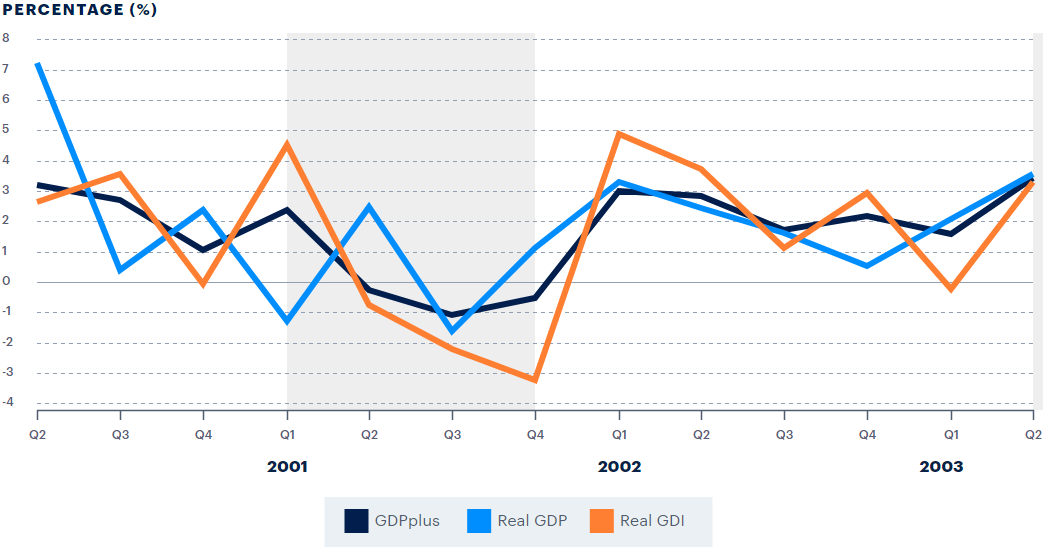
That cycle included similar GDP-related revision issues, with Q1 2001 having had its first three advanced estimates of +2.0%, +1.3%, and +1.2%, with the ultimate revision shown on the report at -1.3%. It just so happened that the cycle had a big divergence at the cycle turn between GDP and GDI per the revised data. So far this cycle, GDPplus has now been negative for two quarters, with GDI leading the way to the downside. Q4 GDI was recently revised down by over 2%, and now stands at -3.4%. Is it possible GDP for earlier this year is eventually revised lower?
It is certainly possible, though it could also be revised higher for specific quarters and still be consistent with early-stage recession, as we saw in Q2 2008, where the first advanced estimate was +1.9%, and the report above showed revised at +2.3%. This cycle has also included idiosyncratic elements from pandemic-era distortions, including industry-specific labor shortages and related backlogs in many of those industries that probably saw production persist into the first half of 2023. Here were graphs of the manufacturing and services ISM backlog from the most recent reports:


We can see the front end of the cycle via manufacturing going below the 50 level (supposed to indicate expansion above vs contraction below) in late 2022, with services now having joined towards the middle of 2023. Activity and new orders remain elevated in services, but inventories are as well. These should be the next shoes to drop, with large-scale layoffs in manufacturing commencing over the remaining months of 2023.
So while this drawdown period in the Dodo has been Doo Doo, including some of my dumb dumb decision-making, the strategy and cyclical progression remain on track, including as a tool to try and learn.
With this week’s massive options expiry, realized and implied equity market volatility having been crushed to very low levels, and a variety of indications of excessive bullishness and potential exhaustion setups in major equity indexes, additional model tweaks are likely when/if those conditions begin to manifest in a change in trend. I may add additional volatility-specific exposure and am considering adding some fixed income exposure in the ‘belly’ of the yield curve.
Excellent read as always. Thanks for your insight, Kayfabe.
My comments got deleted as had to change accounts (subscription on other one). Wish that didn’t happen