KISS Update

A lot has transpired in global financial markets since I wrote Kiss It Patiently on October 21, 2022. One of the extremely challenging aspects of navigating business cycles as investors are that ‘soft landings’ look a lot like periods when the economy is transitioning into, and/or early in a recession. Financial markets have certainly moved a lot since October, but has the business cycle outlook changed for the better?
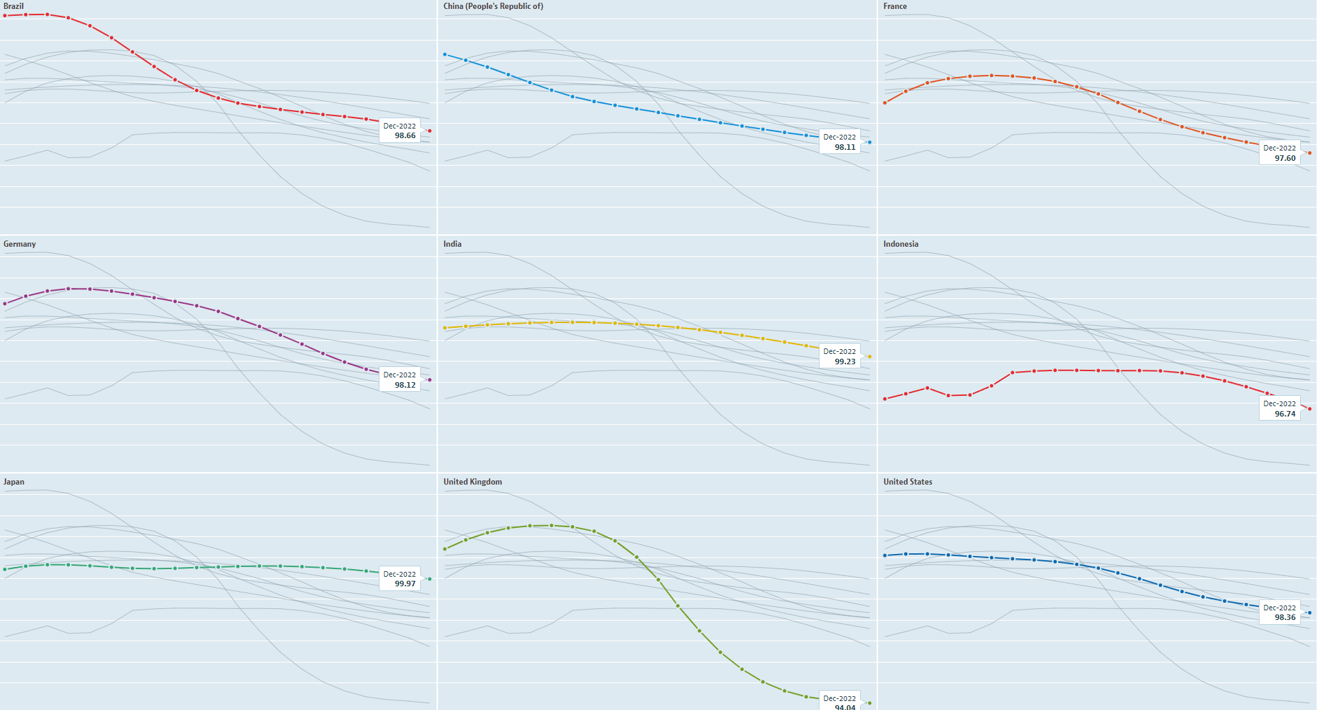
This is the first in a series of charts from the OECD website, where they offer a nifty visualization tool. Apologies for the relatively low quality, but the first batch here are all the same nine countries’ leading economic indicators:
Brazil, China, France
Germany, India, Indonesia
Japan, UK, US
The first chart showed mid-2021 through December 2022, and we can see the process of each leading indicator rolled over. These indicators are intended to forecast economic growth 6-9 months in advance, which is a key concept to keep in mind. As of last month, the UK had the most negative LEI, but none had yet turned back up. Why is this potentially important?
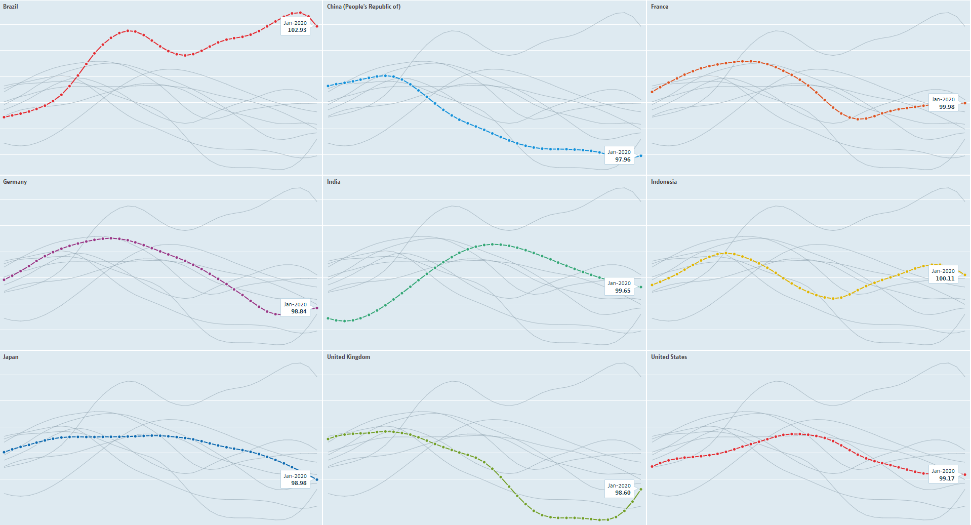
What does a ‘soft landing’ look like? Here were the LEI’s going back to the mid-1990s, showing late 1993 into early 1996:

Please note the dispersion in the LEI’s - obviously the relative sizes of the economies have changed over time. For example, China’s economy was a fraction of its current size during this period. I am focusing upon the relative resilience of the global economy within the context of business cycle analysis.
That mid-1990s soft landing took place as Alan Greenspan, then the US Federal Reserve chairperson, tightened monetary policy pro-actively using leading inflation indicators. That was in contrast to the present, where global central banks are tightening in the most unified fashion in history on a reactive basis, after having completely misjudged the inflation cycle.
Here was the soft landing that many reference when the Powell Fed tightened in 2018 into 2019:
The chart started in early 2017, and once again showed a dispersion in the economies, with a sequence of LEI’s curling back up. What about the COVID recession?

The chart offered context as to why the recession was unusual, in that economies were in varying states of a ‘blah’ in their business cycles when the lockdowns hit. The first to lockdown was China in January 2020, and that was clearly evident via the LEI. With all the talk of lockdowns ending recently, note the disparity in LEI’s during that period and the present (first chart above).
Now that we have taken a look at soft landings, here was what a severe global recession looked like in the mid-1970’s:
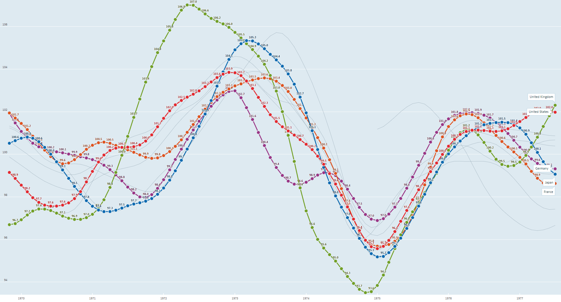
Data was not available for all nine of the countries during the period displayed (1969-1976), and this chart had those available together. We can see the rolling nature of the LEI’s headed into the recession, and how the reflexive feedback loop resulted in them lining up in a synchronized fashion as a global business cycle contraction unfolded.
The US LEI peaked in December 1972 and first dropped below 100 in March 1974. Here was a chart of the S&P 500 Index (price only) from late 1971 through 1975:
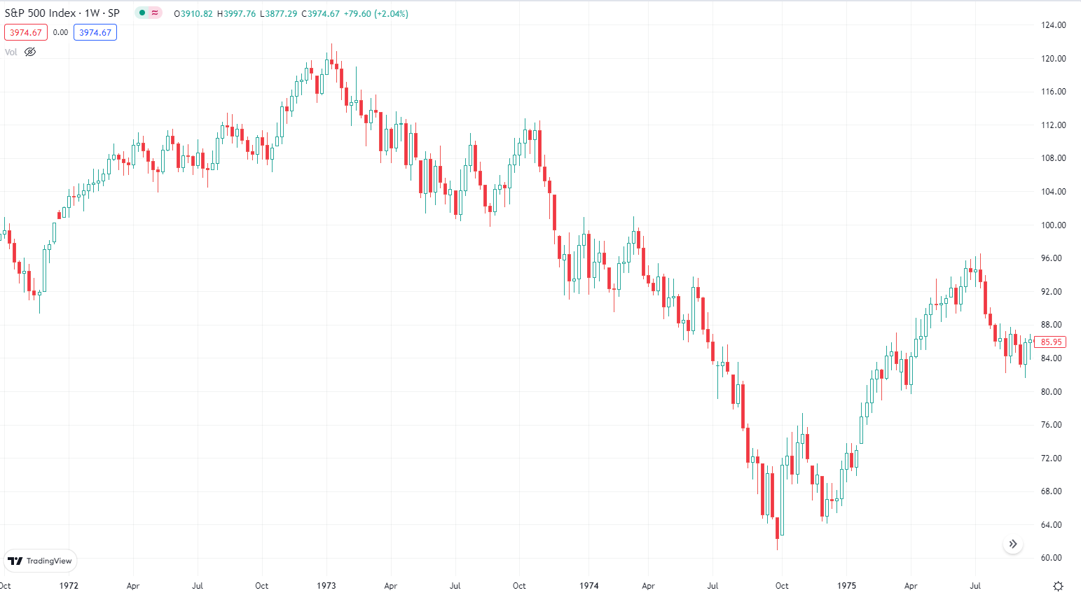
As common in cyclal bear markets, there were various counter-trend rallies, including an 11 week rally of about 11% from peak to trough in 1973. All the while, the LEI’s were trending down and headed towards a severe global recession. The S&P 500 declined by another third from March 1974 until the ultimate low. NBER would subsequently date the recession as having occurred from November 1973 until March 1975.

I was sent that graphic via this Tweet by a friend, and thought it was a good way to visualize where markets may be. It is important to try and maintain humility and intellectual flexibility when trying to forecast, and really all we can do is to think in terms of conditional probabilities.
Until leading indicators begin to display some signs of an upturn, I believe a Bayesian probability framework makes sense relative to the business cycle and financial markets. The significant moves in financial markets over the past three months has resulted in a lot of analytical gymnastics, which appear to me to be rationalizing the current environment and how Return to “normal” will occur. I continue to prefer this: