

Bushwhacked Barometer

A return to Kayfabe Capital Towers this week after an extended hiatus, with the US presidential cycle having kicked off post-Labor Day weekend. Suffering through the idea of the current two leading candidates had me reflecting upon the first presidential election of my ‘adult’ life, which was President George HW Bush’s reelection attempt in 1992.
The economy and post-Reagan era deficits were front and center, despite Bush having enjoyed high levels of approval ratings during and coming out of the first Gulf War.

His reneging on the “Read my lips, no new taxes" pledge along with Ross Perot’s third-party candidacy, and the James Carville-inspired “It’s the economy, stupid” focus of the Clinton campaign, capitalized upon the following:

The graphic shows median household income adjusted for inflation, reported annually by the US Census Bureau, through the duration of Bush’s term, with the shaded area designating the July 1990 to March 1991 recession. For many households, that metric reflected their reality, which accompanied the cultural transition from the coked-out Don Johnson-esque 1980s to the flannel-wearing grunge era emerging in the early 1990s.
Many ‘macro’ metrics people reference and use are averages as opposed to medians- here is an example from that period:

I highlight the quarter in which the election took place, as it displays the recovery to that point to be above the pre-recession peak in 1990. Of course, regardless of party, an incumbent politician and party will use what they can in order to campaign to retain power.
So where do things stand today?
With the employment situation still relatively robust (though seemingly deteriorating), the rate of inflation falling, and pre-revised GDP reports still suggesting the US economy has been growing, the current incumbents will surely have ample material with which to campaign, but are they poised to get Bushwhacked?
Despite widespread capitulation about the risks of recession, the ‘sandpile’ sequence I have been referencing during this year continues. Given the breadth and intensity of the capitulation, it is probably a good time to refresh how we see business cycles at Kayfabe Capital Towers.
Definitionally, a recession cannot occur until job losses take place and intensify at a material rate. I have regularly referred to the 1973-1975 and early 1980s double dip recessions as important examples of recessionary cycles that occurred following steep inflation spikes and evolved with the labor market remaining resilient well into what were EVENTUALLY dated to have been recessions.
This is where the sandpile concept comes into play, as the specific sequencing and portions of the pile that ‘avalanche’ are different in every recession. This cycle has been further complicated by avalanches taking place outside the US, as is now pretty widely recognized as unfolding in much of Europe. Many important sections of the US sandpile began to avalanche late in Q3 and/or into Q4 last year.
Production, sales, income, and labor are the broad elements monitored for business cycle dating. A recession is when the sandpile avalanche reaches a point of severity where a feedback loop gets created amongst those four elements. Many focus on Gross Domestic Product (GDP), but there are many issues with that data from a quality perspective (subject to large revisions) in real-time.
The Kayfabe Capital process monitors for risks of the sandpile having reached critical, or even hypercritical system conditions, and then for evidence that an avalanche has begun. What is the evidence of a potential avalanche having already started?
Let us review the four elements using the most recent data, starting with sales:

The graphic shows the broadest measure of sales in the US, in which retail sales is just one component, along with manufacturers and merchant wholesalers, and compares it with the all urban consumer price index - both year over year % change.
We can see from the graphic that the initial wild swings down and then up around the pandemic lockdown periods transitioned into a pretty steep downturn in the rate of change. In fact, the rates of change crossed in the November 2022 data, with total business sales turning ‘negative’ in after-inflation or real terms. The decline has accelerated in recent months, with the nominal year-of-year rate of change turning negative and the decline in real terms accelerating.
As sales have been weakening, here is where the broadest measures of inventories are:

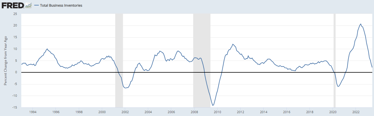
As we can see from the level and rate of change above, the inventory cycle has not even really ‘kicked off’ yet. As covered in the Mack Attack post in January, the feedback loops triggered by excess inventories relative to demand are non-linear.
While GDP is often referred to as the most important gauge for the economy, and ‘product’ is literally part of the name, it also includes things like the impact of net trade and changes in inventory, etc. Industrial production is another noteworthy and more direct gauge of production:

Here we see the same historical time period as the prior graphic, with the year-over-year rate of change being below the all urban CPI for quite some time, but has also experienced a renewed decline in nominal terms since September 2022, having also tipped into be marginally negative per the latest reports for each of May, June, and July (the latest) 2023.
With broad measures of sales and production not looking very good, what about incomes? This is where the average vs the median comes back into the conversation, but first a broad measure of income, Real Gross Domestic Income (GDI):

This includes households as well as business/corporate incomes and is theoretically supposed to match GDP over time. It is notably at a record gap with GDP per the most recent report.
Another widely monitored metric for income is real personal income excluding transfer payments:
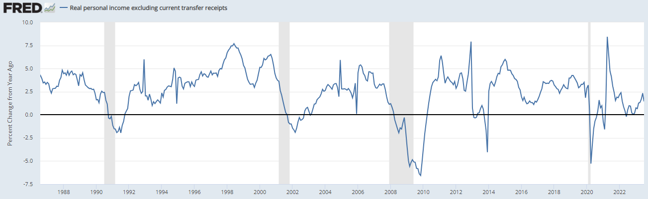
Here we see a divergence between sales and production, as the metric has gone up since the beginning of 2023. Importantly, this is an average and also there were significant cost of living adjustments that began in January 2023 as the high inflation levels of 2022 triggered a lagged adjustment, which with the rate of inflation declining over 2023 to date, may be contributing to the increase.
If incomes and real purchasing power were increasing for a lot of people (average vs median or mode), is it reasonable to think it may manifest in retail sales?

We see here that the year-over-year rate of change in retail sales fell below that of all urban CPI in November 2022 and has remained below since, though the nominal rate of change bumped up in July.
Here is personal consumption expenditures excluding food and energy (again year-over-year rate of change):
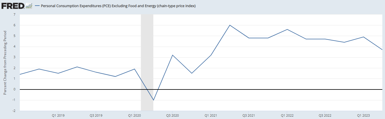
It is a quarterly frequency and we can see it generally trending down over 2022 with a bump in Q1 2023 that coincided with the cost of living adjustments in January, but also remember this is an average.
Unfortunately, the median household income data is reported annually and lags badly, but here is the most recent:

We once again see the Bushwhacked era on the graphic, and also the hit post-2019 through 2021 - the update through 2022 should arrive later this month, but given the inflation of that year and into 2023, one may be able to make a decent guess directionally.
This leads me back to the initial question - do the current incumbents face a Bushwhacked scenario? Actually, I’d argue that is more likely to be the most incumbent-friendly scenario from a narrative-peddling perspective.
With continued evidence that the sandpile avalanche began in the US late last year, the vitally important section of the pile still to succumb may be beginning to buckle:

As we can see, the year-over-year rate of change in total non-farm employees remains well into positive territory, but the trend is pretty clear. In addition, the 2.01% rate just reported for August compares to the 1.88% rate for August 1974 just when that cycle’s labor market accelerated to the downside as that sandpile avalanche spread. Last November’s 3.43% rate of change, the month when sales and production both dropped below CPI (as shown above), compares with the 3.67% rate for December 1973, when that avalanche was subsequently dated to have begun.
In true Kayfabe Capital fashion, the recession is likely both fake and real at the same time, with much of the ‘audience’ currently in a markets-fueled mob once again quite oblivious to reality.
What many typically refer to as ‘recession’ is when the proverbial you know what hits the fan, when the avalanche severity becomes widely known and financial markets go haywire. Of course, it can be too late for many to react once these things become ‘obvious.’ If/when job losses accelerate, then along with things like Mack Attacks are likely to trigger all sorts of Schrodinger’s Bak.
Great to read another article! Thank you!
I’m not sure how the current setup will be incumbent narrative friendly… given Eric Basmajian’s work showing unemployment likely on course with other recessions post 3m10y inversion. We may still see u3 rise before the end of this year, and it’s hard to Kayfabe that away let alone for another 10 months. U1 just had a dramatic upswing and I think u2 and u3 will follow. Europe and China are now falling into abyss, the rest of the world looking over. Now sure, you might be able to spin it as a global phenomenon, but I think the more likely scenario is another “It’s the economy, stupid.” When people start losing jobs, they blame the President (and somehow the Fed gets away … Volcker, Greenspan, and Bernanke are all, for the most part, revered!)
Great analysis as usual. Always enjoy reading your work!